NIKKI WEAVER
Leading People, Shaping Systems & Building Genuine Connection

CLIENT CASE STUDY:
"It was a blessing to have Nikki as my right-hand woman. With a large portfolio of multiple brands, and numerous sites across various states, the brand refresh was a huge undertaking. Having a Branding Consultant I could trust, gave me piece of mind that everything was in-hand. Nikki provided expert guidance and a calm, clear perspective on each project."
CHRISTINE THORPE
HEAD OF MARKETING | ARCADIA GROUP


ABOUT THE PROJECT
Brand Portfolio Strategy | Creative Direction | Brand Evolution
Challenge
In 2020, Arcadia Group engaged me to support the evolution of several brands within its retirement living portfolio, each with its own market position, audience and personality.
Rather than creating entirely new brands, the objective was to modernise and strengthen each identity while maintaining existing brand recognition and ensuring consistency across a broad range of marketing touchpoints.
A Portfolio Approach
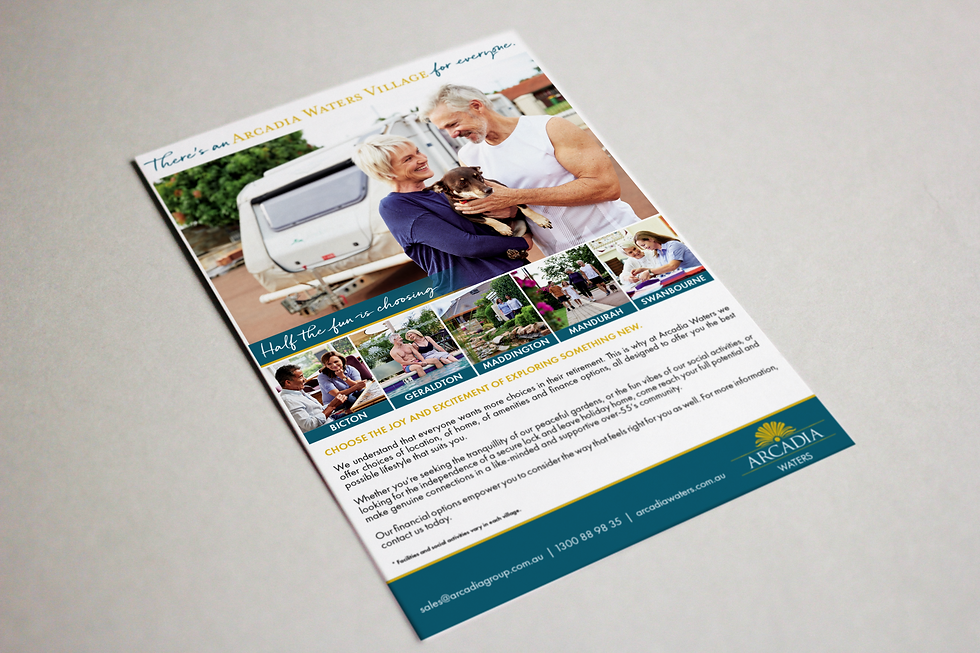
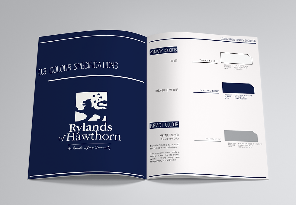
Working across Arcadia Waters, Rylands and Hidden Valley / La Dimora, I developed tailored brand refinements for each business while supporting the broader marketing team with strategic creative direction.
The scope included:
• Brand refinement and visual identity evolution
• Brand guidelines
• Marketing collateral
• Press advertising
• Environmental signage
• Creative direction for photography
• Messaging refinement
• Brand advisory
• Campaign planning and strategic input
Three Brands. Three Different Stories.
Arcadia Waters
Refreshing an established retirement living brand to feel more contemporary, approachable and aspirational while retaining existing recognition across multiple WA communities.
Rylands
Elevating a premium retirement brand through refined messaging, updated creative direction and a bespoke photography approach that better reflected the lifestyle experience.
Hidden Valley / La Dimora
A more substantial repositioning focused on destination appeal, including a refreshed logo and visual identity designed to support a broader domestic and international audience.
Outcome
Although each project had different objectives, together they demonstrated the value of approaching branding as an evolving system rather than a one-off design exercise.
Working closely with the in-house marketing team allowed strategic thinking and creative execution to remain aligned across multiple brands, campaigns and customer touchpoints.
Reflection
Some of my favourite projects involve stepping into an existing organisation, understanding the moving parts and helping internal teams bring greater clarity and consistency to their brands. Arcadia Group was one of those projects. It wasn't about starting from scratch. It was about recognising what already worked, refining it thoughtfully and creating a stronger foundation for future growth.


the original