
NIKKI WEAVER
Leading People, Shaping Systems & Building Genuine Connection
CLIENT CASE STUDY:
"We had Nikki create our brand back in 2014 and we still love it to this day. It was exactly what we had envisioned and it's stood the test of time."
CHERYL LOARING
FOUNDER/OWNER | DIVINE RADIANCE

ABOUT THE PROJECT
Brand Identity, Brand Development & Website
The Challenge
Divine Radiance Natural Therapies was a holistic health practice offering a diverse range of natural therapies, including naturopathy, Bowen therapy, massage, Reiki, kinesiology, reflexology and rose essences.
The breadth of the practice was both a strength and a branding challenge. Rather than presenting a collection of disconnected therapies, the brand needed to communicate a cohesive approach to wellbeing centred on the individual client and their personal journey.
The founder, Cheryl, described her approach as highly intuitive and partnership-based, working with each client's needs and drawing on different therapeutic modalities to support their wellbeing and transformation.
The brief was therefore to create a brand that felt inviting, safe, contemporary and intriguing, while expressing ideas of nature, spirituality, radiance and personal transformation.
There was also an ambition for the practice to grow into a broader wellbeing offering, potentially bringing multiple practitioners and modalities together under the Divine Radiance name. The identity needed to provide a strong enough foundation to support that evolution.
The Approach
I began with a discovery process designed to uncover what sat behind the list of services: the philosophy, personality and experience the practice wanted clients to associate with Divine Radiance.
The resulting direction centred on four key ideas: nature, radiance, transformation and expansion.
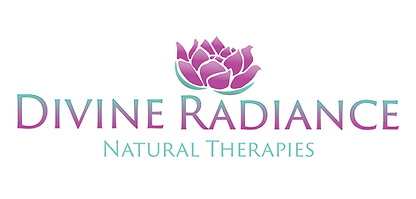
Rather than relying on conventional natural-health imagery, the visual identity was developed around the idea of a lotus emerging and opening, providing a symbolic connection to growth and transformation while giving the brand a distinctive central mark.
The colour palette combined eggplant and aquamarine, balancing the spiritual and natural qualities of the business with a fresher, more contemporary feel. Typography and supporting visual elements were then developed to create a light, elegant identity that could move comfortably between the more personal world of holistic therapy and professional business communications.
The identity was designed as a system rather than simply a logo, with clear rules for logo construction, proportions, clear space, typography and application documented in a comprehensive set of brand guidelines.
The Solution
I developed the complete Divine Radiance brand identity and digital presence, creating a consistent visual language that could be applied across both online and physical touchpoints.
The project included:
-
Logo development, including five initial concepts and refinement of the selected direction
-
Colour palette and visual theme
-
Brand identity guidelines, covering logo construction, clear space, typography and application
-
Website design and content
-
Business card design
-
Letterhead and stationery
-
Compliments slip
-
Facebook cover and profile assets
-
Digital and print-ready marketing assets
The brand guidelines established a clear hierarchy for typography, including a distinctive display treatment for the logo and headings alongside a primary typeface for website, stationery, marketing materials and general communications.
Digital Experience
The website extended the new identity into a complete digital experience, bringing together the practice's philosophy, services and contact journey under the new brand.
The design used the new logo, colour palette, typography and imagery to create a calm, spacious environment while maintaining enough visual personality to distinguish Divine Radiance from a generic natural-health practice.
The site's messaging also brought the transformation concept directly into the customer experience, using the brand's tagline:
Inspiring transformation for body and soul.
Outcome
The project gave Divine Radiance a cohesive brand platform across its identity, website, social presence and business communications, replacing a broad collection of therapeutic services with a recognisable and unified brand. Most importantly, the identity has endured.
More than a decade after the original brand was developed, the Divine Radiance logo and core visual identity are still being used by the business today, including on its current website. The current site has since been rebuilt using a different layout, but the original brand mark, colour language and tagline remain recognisable at the heart of the business's digital presence.
That longevity is particularly meaningful for an identity created in 2014: the work wasn't designed simply to look current at the time. It created a distinctive enough foundation to continue working as the business and its digital presence evolved.
My Role:
Brand strategy & discovery · Creative direction · Visual identity · Logo design · Brand guidelines · Website design & content · Digital design · Print collateral
the original Branding


