NIKKI WEAVER
Leading People, Shaping Systems & Building Geniune Connection

CLIENT CASE STUDY:
"Exceptional Brand Design Services by Nikki - A Five-Star Experience!
Nikki truly understands the essence of effective branding. I have had the joy of working with her over many years and brands, and each time she has created truly unique branding for my practice.
Nikki is professional, friendly, very easy to work with and has the ability to create eye catching and designs that suit your needs.
I wholeheartedly recommend Nikki to anyone seeking top-notch brand design services. Her exceptional creativity, attention to detail, professionalism, and ability to bring a brand to life are truly commendable."
MARIE SIKORA
FOUNDER | SOUL AWARENESS


ABOUT THE PROJECT
I created the branding for Marie's very first business, Flower & Feather Healing Essentials way back in 2015 and, to this day, it's still one of my favourite brand kits! Although Marie is no longer running Flower & Feather I still love showing off the assets with that beautiful desert sunset.
Challenge
Soul Awareness marked a new chapter for Marie Sikora and a significant evolution from her previous business, Flower & Feather Healing Essentials, which I originally branded in 2015.
While Flower & Feather was deeply connected to Marie’s relationship with Native American-inspired spirituality and her work with an American Wolf Sanctuary, Soul Awareness represented a return to her Celtic ancestry and a deeper connection with the natural world.
The challenge was to create a brand identity that honoured this new direction while capturing Marie’s philosophy around Mother Earth, natural wisdom and the healing treasures found within the earth.
Brand Strategy
Having previously worked with Marie on Flower & Feather, I understood the importance of creating a brand that felt deeply connected to her personal story and beliefs.
For Soul Awareness, the strategy centred around themes of nature, grounding and renewal. Rather than drawing from the spiritual symbolism of her previous brand, this identity needed to feel rooted in ancient earth wisdom, Celtic heritage and the natural cycles of life.
The brand personality was shaped around the relationship between humanity and the earth: organic, nurturing, intuitive and connected.
Creative Direction
The visual identity was inspired by the earth itself and the layers of knowledge, energy and history held within it.
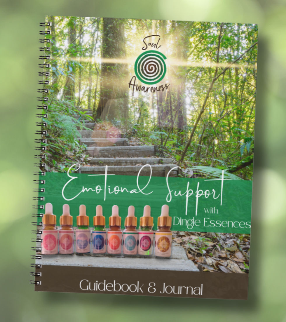
A rich palette of greens and browns created an earthy, grounded foundation, while the logomark incorporated organic forms and flowing spirals to represent the cycles of nature, personal growth and the interconnectedness of all things.
The design language was intentionally organic rather than structured, creating a sense of movement, harmony and connection.
To extend the brand experience, I also developed a collection of bottle labels for Marie’s range of essences. These designs allowed each individual product to have its own personality and colour variation while remaining clearly connected to the wider Soul Awareness brand family.
Outcome
The result was a cohesive, meaningful brand identity that reflected Marie’s new business direction and created a strong foundation for her range of natural products and healing offerings.
This project was a beautiful reminder that branding is not just about creating something visually appealing. It is about understanding the story, values and energy behind a business, then translating those elements into something tangible that people can connect with.
After nearly a decade of working together across different business chapters, Soul Awareness represented another opportunity to help Marie bring her evolving vision to life.


_edited.jpg)