NIKKI WEAVER
Leading People, Shaping Systems & Building Genuine Connection

CLIENT CASE STUDY:
"Amazing work! I love that Nikki was able to bring my concept to life and include all the elements I had envisioned. The curves through the circle in the logo looks great and instantly reminded me of not only the serpent I was hoping for, but also of water, flow and the yin-yang symbol. I love the way the love heart was incorporated; subtle but powerful! Thank you for the work you have done, Nikki! The finished product is fabulous!"
CHRISTABELLE QUADROS
FOUNDER/OWNER | THE HEART SANCTUARY


ABOUT THE PROJECT
Challenge
When Christabelle approached me to develop the brand identity for The Heart Sanctuary, she already had a clear sense of the feeling she wanted the business to create, but needed support translating that vision into a cohesive visual experience.
The business was built around heart-led connection, personal growth and holistic wellbeing. The challenge was to create a brand identity that captured these values while bringing together the different symbolic elements that were important to Christabelle, including her connection with nature, earthy energy and the serpent as a symbol of transformation and renewal.
Brand Strategy
The foundation of the brand was centred around authenticity, healing and connection. Working through Christabelle’s ideas and inspirations, I explored how the brand could visually communicate a sense of calm, flow and grounded spirituality while still feeling distinctive and memorable.
Rather than creating a purely aesthetic identity, the focus was on developing a brand world that reflected the experience clients would have when entering The Heart Sanctuary: a place of safety, transformation and reconnection.
Creative Direction
I developed several creative concepts, exploring different ways to bring Christabelle’s vision to life. The final direction immediately resonated because it captured the essence of everything she wanted the brand to represent.
The identity incorporated organic forms, earthy tones and flowing visual elements to create a sense of harmony and connection. The serpent symbolism was woven into the design as a representation of transformation, renewal and the continuous cycle of growth.
From the core logo through to supporting brand elements, stationery and visual guidelines, I created a complete brand system designed to provide consistency across every client touchpoint.
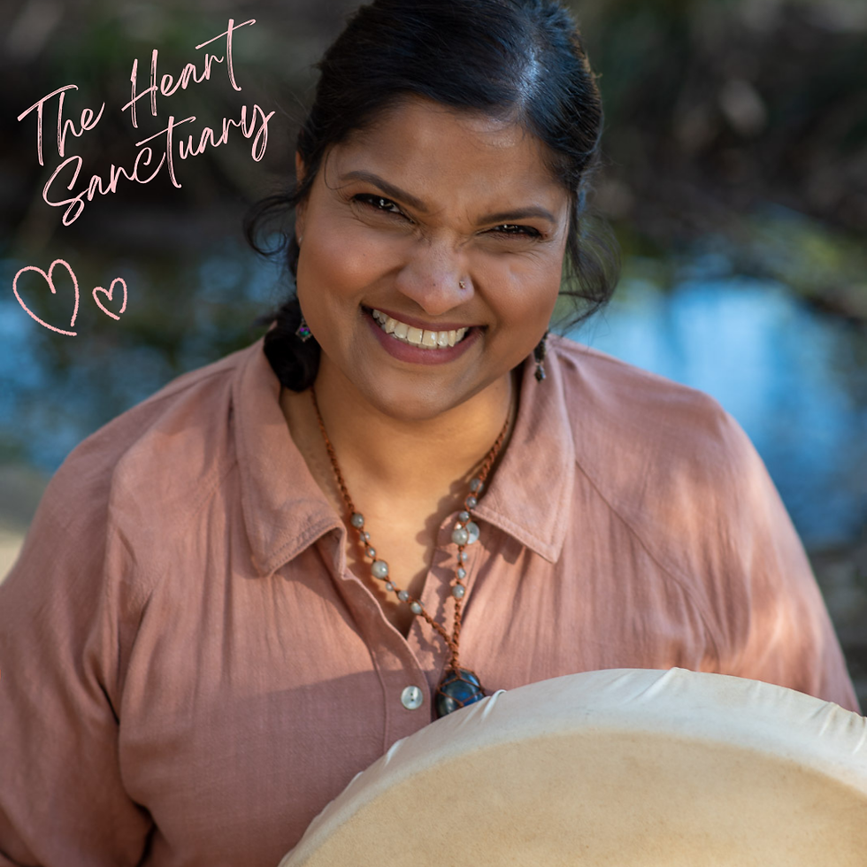
To further bring the brand experience to life, I collaborated with brand photographer Samantha De Souza to develop a collection of imagery that reflected the warmth, authenticity and natural essence of The Heart Sanctuary.
Digital Experience
With the brand identity established, I extended the creative direction into a complete digital experience by designing and building a website that allowed Christabelle to showcase her services, connect with clients and sell products online.
The website combined storytelling, intuitive navigation and ecommerce functionality to create a seamless journey from discovering the brand through to booking services or purchasing products.
Outcome
The result was a cohesive brand ecosystem that transformed Christabelle’s vision into a tangible experience across visual identity, photography, digital presence and customer touchpoints.
This project was a reminder that some of the most meaningful brands begin as feelings and ideas that are difficult to articulate. The role of a brand strategist is to uncover those threads, give them structure and create something that allows others to connect with the vision.
Reflection
I love projects where a founder has a strong emotional connection to their work but needs help translating that feeling into something others can see and experience. The Heart Sanctuary was about creating a visual home for Christabelle’s mission: a brand that feels as peaceful, nurturing and intentional as the work she offers.